The Smart #1 is built on Geely’s Sustainable Experience Architecture (SEA) modular electric vehicle platform, as part of a partnership between Chinese automaker Geely and Mercedes-Benz Group AG, Smart’s parent company (Smart hasn’t been part of Swatch for some time, in case you haven’t been keeping up). The platform variant used for the Smart #1 is a rear-motor, RWD setup, which, though unusual for most carmakers transitioning to EVs, has been the traditional Smart Car layout from day one. The battery pack is a 66 kWh lithium-nickel-cobalt-manganese chemistry, also used by cars like the Chevy Bolt, Renault ZOE, VW ID.3, and others, but notably not like what Tesla uses (Tesla uses mostly lithium-nickel-cobalt-aluminum oxide batteries). All of that sticky battery chemistry should give the Smart #1 (maybe they didn’t want to say “number one” because that means peeing? I just thought of that) a respectable but not astounding range of 273 miles, at least according to the WLTP testing standard; US testing is different, so when/if this comes to America, that number may change. The motor makes a decent 268 horsepower and 253 pound-feet of torque, enough to move the Big Smart from a dead stop to 62 mph in just under seven seconds, which seems plenty fine; the car tops out at 112 mph.
Design-wise, this is a pretty significant departure from Smart’s usual styling vocabulary (see photo above), which tended to rely on the graphical contrast of their safety cell, which is no longer a visible element in this design. Instead we get a remarkably clean and smooth look to the car, with forms that feel like eroded river stones, or maybe a hammer handle worn smooth and curved by decades of continual use.
The main graphical conceit seems to be the floating roof design, which can be had in contrasting colors. I think it works well here, but it doesn’t evoke much about Smart’s past design as much as it really reminds me of another small city car: the Opel Adam.
Here, look at this Opel Adam (on the right), and note the detailing of how the roofline meets the C-pillar; it’s quite similar to the Smart’s (on the left):
That feels remarkably similar. Really, if you showed me this car and told me it was Opel’s new EV version of the Adam, I’d have thought hey, nice job, Opel! That’s a lovely update to the Adam! But, it’s actually a lovely Smart, so I guess it’s Opel’s loss.
Man, that really feels Adam-like. Still, lots of nice details, like that kick-up of the lower dark area before the rear wheelarch, and the wheels themselves, which feel kind of, um, techno-floral? The proportions are good, and I like the bluff front end profile, too.
I do like that pinched dog-bone lighting design, which incorporates a full-width light bar, and that motif carries to the rear, which has a similarly-shaped full-width taillight. The taillights have an interesting particulate texture going on inside them which I think is really appealing and a very nice bit of lighting design:
The interior also plays a lot with light, with an illuminated pattern in the center of the dash and some neon-like light striping along the outer edges of the dash and inside the HVAC vents:
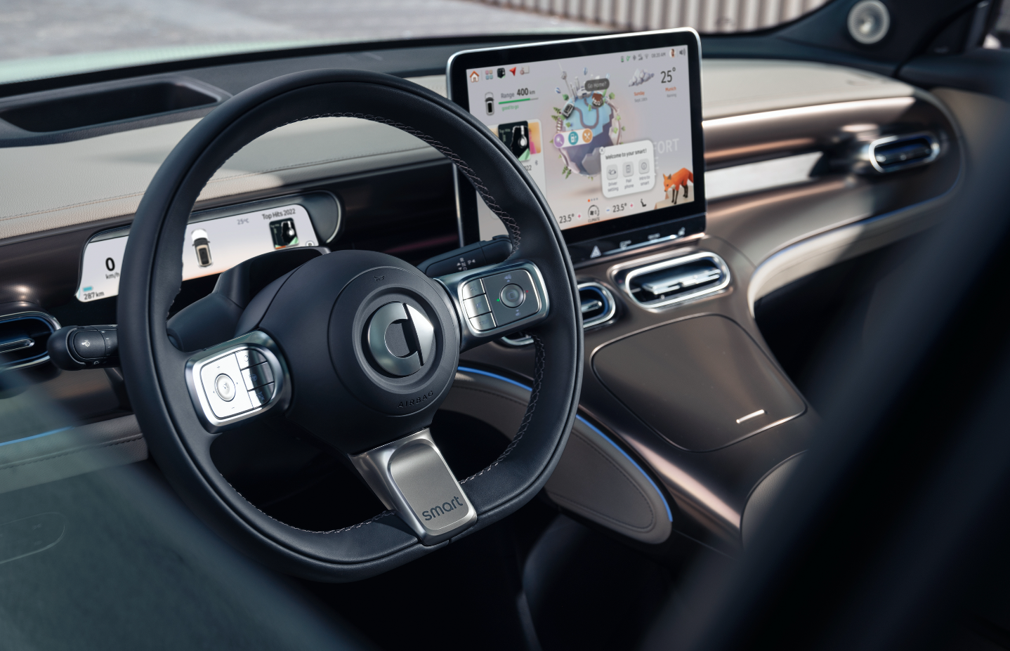
I like what I’m seeing on the interior here; it’s not painfully dark and monochrome, there’s a lot of good surfaces with satisfying-looking curves and a variety of textures going on. Instrument placement looks good, with a wide LCD instrument panel in front of the driver and a big tablet-like center stack screen that houses, I guess, every other control, since there’s hardly any physical buttons to be seen:
I’m not crazy about totally eliminating physical HVAC controls and all that, but it’s becoming so very common I’m starting to feel like an old crank. Sorry, more like an old crank.
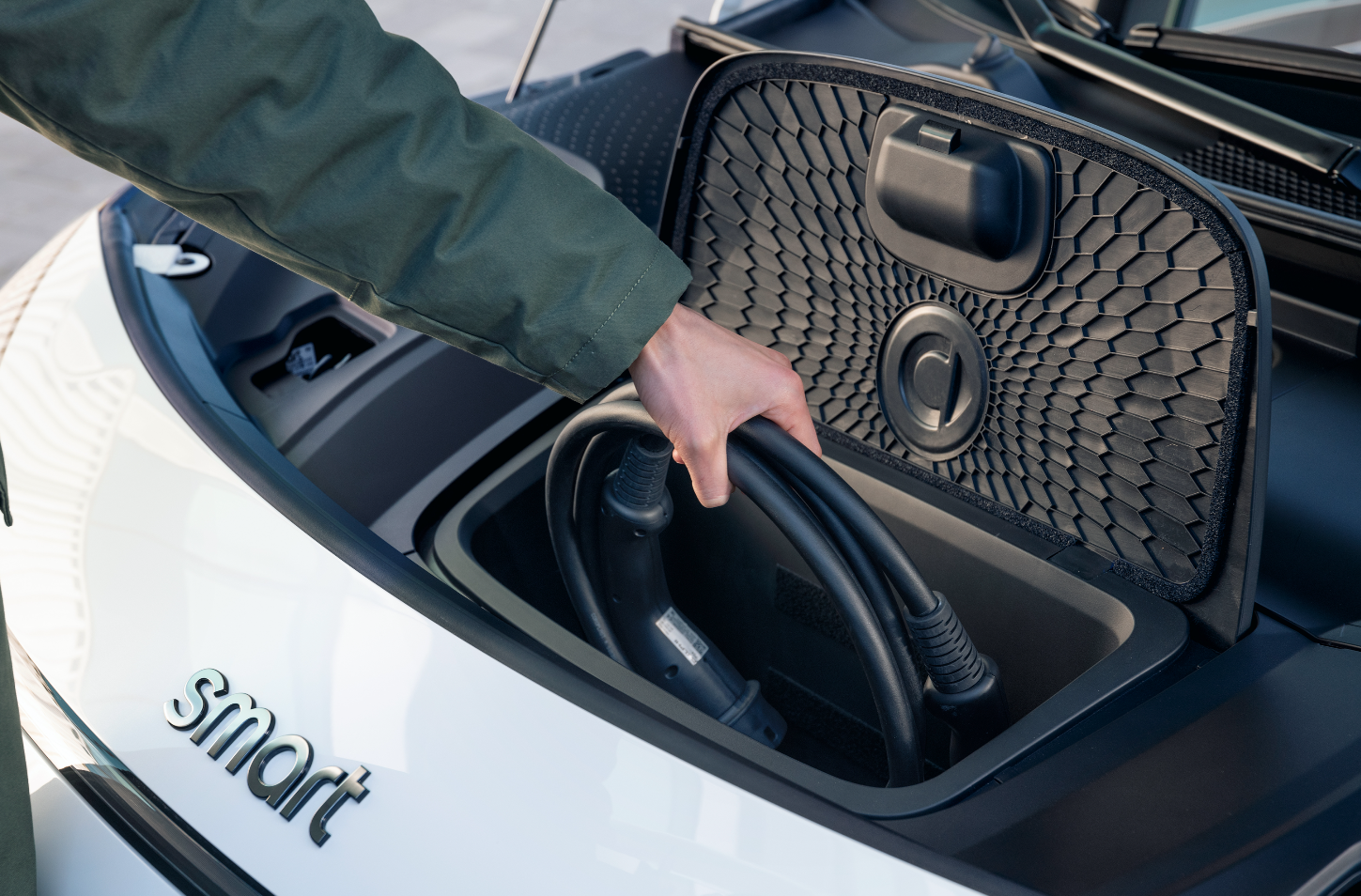
There’s a little pass-through under the center console there, so you and your passenger can clandestinely hold hands, if you’d like. One detail I’m absolutely delighted to see is the inclusion of this tiny yet still useful frunk:
I love that Smart bothered to take the effort to carve out this little volume, because the truth is that even a tiny frunk is useful for things like charging cables, as you can see here, and this effort is absolutely appreciated. Volkswagen should look at this and then at their ID.4’s huge frunkless volume up front and feel a little ashamed. From what I’ve seen, I like what Smart is doing with this little EV thing–it seems practical and pleasant to potentially live with. What I like less is this weird promo campaign they’re doing with kids as Smart’s “future CEO” and other executive staff:
I’m not sure what it is, but there’s something unsettling about this, because I can’t help but wonder how exactly Smart knows what these kids’ future will be? They can’t, unless, and stay with me here, Smart is in control of these children. I’m not accusing anyone of anything yet, but this sure seems like maybe Smart has genetically engineered their ideal future management team and has grown these children in vats, and is currently training them to fulfill their roles as CEOs and VP of Sales and Lead Engineer or whatever.
I’m not saying this image may be a facility at Smart HQ where their future CEO was gestated. I’m also not not saying that. (images: Smart, Opel, 20th Century Fox) The reason to own the original diesel Smart was to be able to drive in a congested city and always find parking. I live in Toronto downtown. If I want to drive across the city centre the average speed is about 20mph. People used to post all sorts of nonsense of Smarts vs Kenworths and the like. The reality was the the Smart is tall and susceptible to crosswinds on a big highway, so I rarely drive it there. It is has a 0-60 time of about 24 seconds. Perfect for the city, and I can get parking in any half spot. After 17 years it has about 22,000 miles on it. I don’t care if there is a little parking dent (though there are not many). The new car looks pretty good but it does not have the same purpose as the original. And that name… dated out of the gate. “Hashtag whatever” has already gone from novel, to trendy, to annoying, to meme fodder, to played out—years ago. It’s like a dad trying out what he thinks is the latest lingo on his middle-schooler. “Your old man is pretty fly, huh?” I would like to see more designs like this… 2 hours of squirting around twisty roads seems like plenty. I think I read somewhere that there was a link between battery storage capacity and the max power that you can draw. Maybe the Autopian’s engineers can explain? But even so you only need the extra watts for 10 seconds… maybe a supercapacitor could add some kick. That might help to juice up the battery a little faster too? The car itself looks great, except that damn stuck-on tablet look. It’s as if they designed this sleek modern interior and then went, “oh crap, we need a screen!” Is it not possible (yet) to just project the contents of the screen onto the lower-middle part of the windshield? Seems like that would solve the ugly screen problem, and be safer, since it’s basically a HUD. What I have become really curious about is did these manufactures actually focus group the idea of removing all physical buttons in their cars? Like, who is this for? What kind of survey led to this outcome? Every so often you see bad ergonomic decisions that are such head scratchers. But I don’t want one. It’s just not special. It feels designed by a committee. Admittedly, a committee with good taste, but still, it feels like it came from marketers, not engineers & designers. The cost-cutting trick of sticking all the controls in a big tablet just sucks. Give me less gimmicks and some buttons I can push without digging through a menu or staring at a screen if cost is an issue. I do really like the seats and that center console, though. Designers are given a blank slate for design, where you absolutely could maximize space (get rid of that dumb hood space,) improve handling (push out the wheels to the corners,) open up the cabin (no drive shaft.) Apart from VW, no one seems to be taking advantage of any of this – I would at least expect Smart to do something interesting, but instead, they waste a third of the vehicle with pointless hood. “Smart One”. How hard was that? They could have called this the Smart E. -The committee, probably.


